We’re still the same, just with more space to grow.
Big news! This week we released an updated brand identity to refresh our look. We believe the new look better matches what we’ve become since 2017, a centralised business process platform that modernises your business, while allowing you to achieve 360° visibility of your business process.
We loved our old logo, look and website and know many felt the same. Yet, we are here to explain why we decided to evolve it.
What’s changed and what hasn’t
We’ve updated our logo, website, typeface, colours and imagery like photography and illustrations. We also evolved from ‘Cartolytics’ to ‘Blocworx’. Our name began as a playful metaphor: mapping processes and analytics. These days we do so much more than that, our name stands for more than its component parts.
Aside from the new colours and illustrations, everything inside our customers Blocworx platform will be largely the same.
We’ve made a few changes to our website that make it easier to find helpful resources. A couple of highlights:
- Our support articles are now easily accessible under the Resource menu. FAQs, customer stories and more can be found under Resources.
- We’ve extended our News, Press & Blog pages to make it easier to find the content your most interested in under the News menu.
- We introduced product categories by industry and business function under the Products menu. A range of products with descriptions and video demonstrations can found the Products menu.
- Click to Buy option directly through our site is now accessible to set your platform up right away. We installed the best payment processing system to ensure a swift transaction.
How we got there
Our first name and logo were created before the company launched. The logo was simple with the company name at the forefront text and a plain dark background. The design was easy to read but not playful and didn’t accurately represent our brand personality. It was two simple colours white and black with no icon to identify our brand. Needless to say, it was time for a change.
Our in-house marketing team worked with Michelle McInerney and the team from Copper Reed, to create a more cohesive visual identity. We started with the logo.
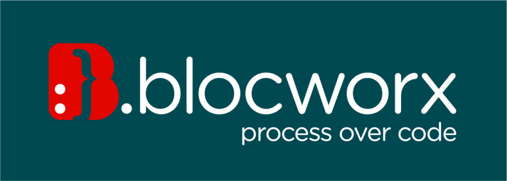
The Blocworx logo uses a simple but vibrant colour palette and we believe is more refined, but still contains the spirit of the original. It’s an evolution and one that can scale easily and work better in many more places.
Our design goal was to better match how we look to our values and the users we serve. The logo shape is in the form of the letter ‘B’ to signifying the company name, Blocworx. The full stop after the letter is a statement to balance the design. A playful character smile symbol is the main visual focus of the logo.
![]()
![]()
The ‘;’ semicolon, is often used in computer programming to separate statements, this represents the programming focus of the company but it’s stylised with curves to appear friendly and even similar to a human face. We believe this modern take on the animation communicates a user-friendly platform that works to support our users.
The tag line, ‘process over code’ was introduced to emphasise how user friendly of our software is for any business to use with no coding necessary. We hope you like this new looks and feel for Blocworx.
Staying true to ourselves
With this redesign, we set out to retain all the weird, lovable elements that endeared our latest customers to Blocworx, while creating space for the brand to grow and connect with even more small business. We didn’t want to loose our heritage in the process, so we focused on capturing the essence of what Blocworx has always been.
Over the next few months, you’ll see all the other visual around Blocworx aligning around this new direction: on the website, in advertising and in some places in the product (though not in a way that will keep you from the important business of getting things done, of course). It’s still us. But more consistent and we hope more instantly recognisable.
If you’re interested in digging into our new products to improve your business, visit https://www.blocworx.com/products/
Author
Isobel Hogan, Blocworx, Marketing Executive


