Introducing the Blocworx’s New and Improved UI
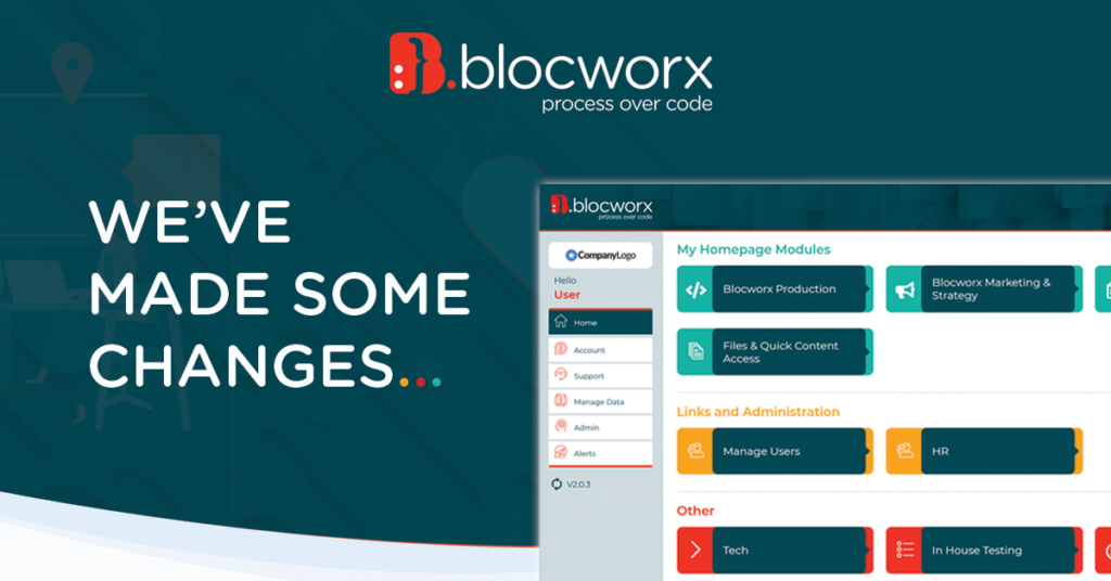
Blocworx is committed to ensuring that every user has a great experience using Blocworx, whether your are a No coder / Citizen Developer or the end user. Every no code or low code solution has to give the user a great experience and this is why we have a team of UI and UX experts dedicated to finding ways to continually improve software. Today we’re excited to announce our new UI that has transformed the look of Blocworx.
NEW COLOURS
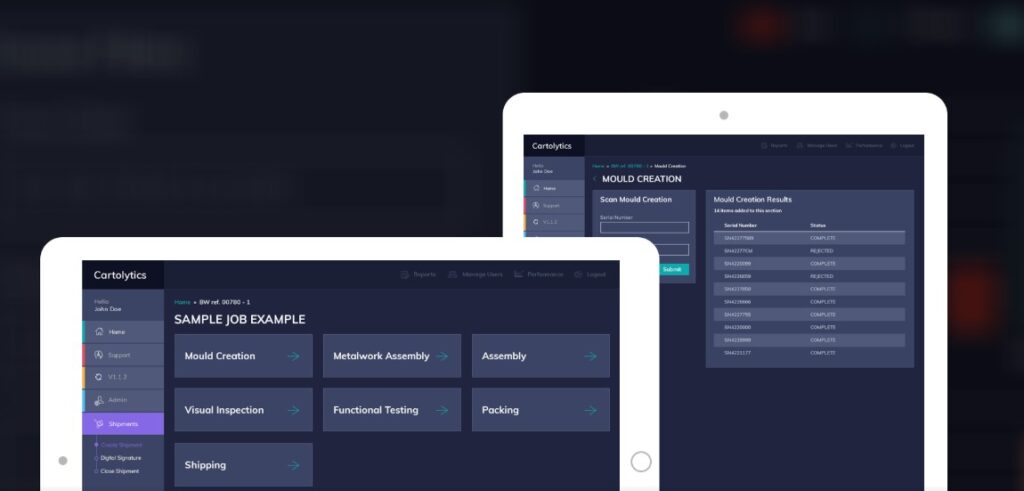
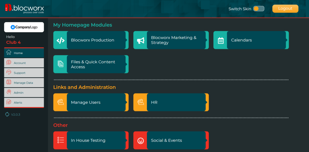
First, we’ve updated the look and feel of the system with new colours based on our new brand. These colours are not only pleasing to the eye, but are designed to streamline the system. For example, modules are no longer a single colour which can make it difficult to identify specific tasks, new colours make it easier to group the data, and new button styles highlight modules to draw your eye to the data that matters most.
Classic Cartolytics UI- With classic brand colours
New Blocworx UI – With new brand colours
INTRODUCTION OF ICONS
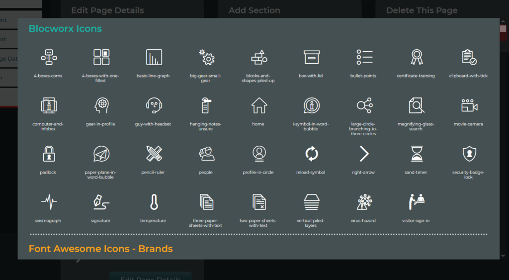
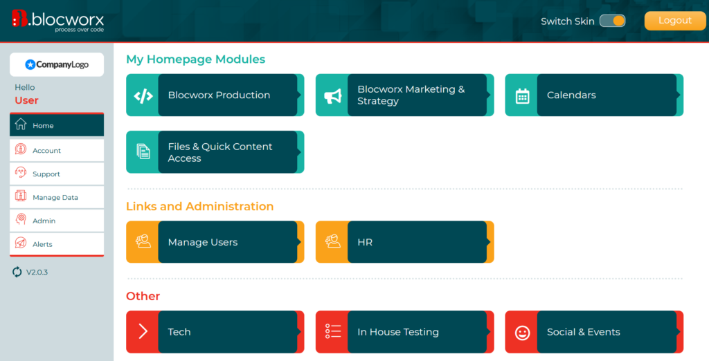
Furthermore, we’ve simplified the system by introducing module icons. In the classic UI, there were often multiple lists of modules. These paths were named but did not contain visual cues to help users quickly recognised the modules and click through to the next step. In the new UI, we’ve simplified the process of identifying users’ workflows. For example, a Calendar icon is available to symbolise the Calendar module for scheduling tasks. This is one example of a principle you’ll see applied throughout the new UI – simplifying the experience for every user.
Classic Cartolytics UI – Classic module

New Blocworx UI – New module icons
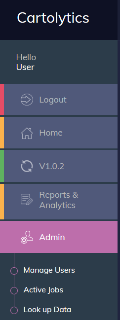
NEW SIDEBAR MENU
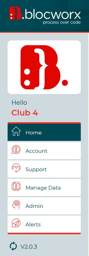
Next, we created a new sidebar menu that centralises user’s workflow and allows a customer logo to be visible on the interface. The customer logo offers platform personalisation for the end-user. Additionally, the sidebar includes new paths such as ‘Account’, ‘Manage Data’ and ‘Alerts’. These new paths provide users a simpler way to quickly access their controls to manage their system.
Classic Cartolytics UI – Classic sidebar menu
New Blocworx UI – New sidebar menu
DARK & LIGHT MODE
Next, we revised our dark & light mode skins to give users the option to switch between two inviting backgrounds. We researched preferences and found that some people find white text on backgrounds much easier to read, while others find a darker interface can reduce the glare when you’re viewing screens and using the platform after dark. If you prefer a white or dark background it’s simple to alternate between these with the ‘Switch Skin’ toggle bar.
New Blocworx UI – Dark mode

New Blocworx UI – Light mode
FORM DESIGN IMPROVEMENTS
Finally, we’ve enhanced our form design to allow better visibility of data and offer a more aesthetically appealing experience through modern rounded buttons. In addition, a toolbar has been applied to inform users when they are editing a form and the option to cancel editing. This offers users a simple and more engaging experience when entering data onto the platform.
Classic Cartolytics UI – Classic form design

New and Improved Blocworx UI – New form design

All of these enhancements are available today to all Blocworx users. Existing customers will be updated to the new user interface automatically. New Blocworx users will land in the new user interface by default upon logging in.
We’d like to thank the design team at Copper Reed Studio for all their work in designing the new Blocworx UI.
As always, we’re eager to hear what you think. If you have feedback on these enhancements about the new and improved UI or ideas for additional enhancements you’d like to see, please submit them via email here: info@blocworx.com.
Or contact us here and Follow us on LinkedIn here.
